A stretch goal, the morning after branding the NuGet server with a watercolour raccoon: the source photo was shot on cold-press paper under whatever light was handy, and it shows. Can a handful of ImageMagick scripts fix the bad lighting? Mostly yes — and the one textbook technique that should have fixed the rest is the one that failed.
What We Worked On
The raccoon was photographed, not scanned: a warm cast, a paper that photographs grey instead of white, and an uneven wash of light across the sheet. The goal was a small kit of ImageMagick correction scripts, tried against the measured problems rather than guessed, ending in one recipe worth keeping.
Diagnosing the Light First
Before touching a pixel, measure. Two cheap signals tell you almost everything: the overall channel means (a colour cast pulls R/G/B apart) and the paper colour in each corner (uneven light makes the corners disagree; bad exposure makes “white” paper land far from 250).
On the raccoon that prints:
Warm cast: the means lean warm (R well above B). Under-exposed / dull: “white” paper sits at 188–245, not ~250. Uneven gradient: the corners disagree by ~55 levels — bright at bottom-left, dim at top-right. Now we know what to aim each tool at.
The Corrections, One Knob at a Time
The cheap global fixes do most of the work. -auto-level stretches each channel to full range while preserving colour; -contrast-stretch does the same but lets you clip a tiny percentage to really snap the paper white:
For the warm cast specifically, a paper-referenced white balance: sample a strip that’s mostly paper, then scale each channel so that strip averages back to grey.
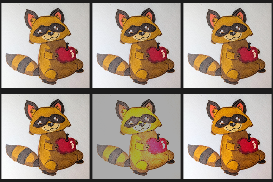
Here are the contenders side by side — source, white balance, auto-level, contrast-stretch, the flat-field (next section), and the final polish:
The Flat-Field That Wasn’t
The textbook fix for an uneven illumination gradient is flat-fielding: divide the image by a heavily blurred copy of itself — your estimate of the light — and restore the tone. My first attempt blurred in colour and the divide dragged the midtones green; blurring in grayscale fixes the hue shift, so the brightness is corrected without tinting:
Flat-fielding assumes the subject sits on a roughly mid-grey field; our subject sits on a bright paper, so dividing by the illumination shoves the paper past white and blows the highlights — the whole frame goes pale and faintly green. It is the right tool for a scanned document and the wrong tool for this picture. Kept in the kit because the comparison is the lesson: measure, try, and look, because the canonical answer is sometimes wrong for your image.
The Recipe That Worked
No flat-field. Just: white balance, a white-point stretch to brighten the dull paper, a vibrance bump so the watercolour reads, and a gentle S-curve for depth.
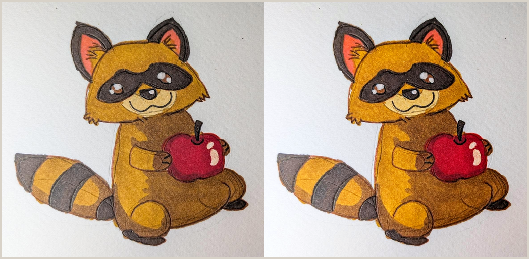
Measured, the paper went from luminance 245 to 250 (clean white at last) and mean saturation from 25% to 37% — the apple deepens to a true cadmium red, the fur to saturated sienna, the mask to a proper black. Crucially this also feeds a better cutout: an evenly-lit, well-exposed raccoon segments more cleanly than one with a grey wash creeping up one side.
What Went Well
Measure-first paid off. The diagnostic numbers named the cast, the exposure, and the gradient before any guessing, so each tool had a target.
The boring tools won. -auto-level, -contrast-stretch, -modulate and a paper white balance did 90% of the work in four short lines.
Every script is runnable and embedded verbatim by the same deterministic builder the first raccoon post used.
What Didn’t Go Well
read R G B < <(convert …) returns non-zero when the convert output has no trailing newline, and under set -e that silently killed the script after assigning the variables. Adding \n to the -format string fixed it. The interactive prototype had no set -e, so the bug only appeared once the code became a real script — hardening a script can introduce the bug.
The colour-blur flat-field tinted the midtones green until the blur was taken in grayscale — and even corrected, flat-fielding was simply the wrong tool for a bright-paper subject.
Takeaways
-
1Diagnose before you correct.
Corner samples + channel means turn “it looks off” into “warm cast, +55 gradient, paper at 190.”
-
2Global tone beats clever local tricks on a bright background.
Reach for
-contrast-stretchand white balance before flat-fielding. -
3A grayscale illumination map corrects brightness without shifting hue.
If you must flat-field, never divide by a colour blur.
-
4Newline-terminate
-formatoutput you feed toreadunderset -e.Otherwise the missing newline makes
readreturn non-zero and the script dies mid-stride.
The Watercolor
If the first raccoon piece was painted on the paper, this one is painted about the light falling on the paper. I’d lay the same bandit down twice on one sheet and let the difference be the whole composition.
The left figure I’d paint under a dirty north window: ochre and raw umber muddied with a grey wash that pools heavier toward the top-right corner, the way the photograph’s light died over there. Everything a half-stop too dim, the apple a brick rather than a jewel, the white of the page really a tired oatmeal. Honest, and a little sad.
Then I’d reach for the same three pigments at full strength and paint the right figure as if someone finally opened the curtains: the paper snapping to true white, the fur deepening to confident sienna, the apple flaring cadmium, the mask going from charcoal smudge to clean black velvet. Between them, faint, I’d sketch the one experiment that didn’t make it — a third raccoon ghosted in pale green, bleached where the flat-field divide pushed him past the paper. He’s the cautionary underpainting: the move the textbook promised would work, left visible under the varnish so the next person remembers to look and not just trust the recipe.